Our first assignment is to set an assigned quote in 10pt. Frutiger (one weight only) in a 7″ square, horizontal type only. In at least 10 variations.
Strangely enough, my quote is from the Tao Te Ching, a book I have sitting on my desk beside all my design books. The passage I have to set begins, “A great square has no corners.” But just before that is a passage I am thinking about now, here in school:
The Way’s brightness looks like darkness; Advancing on the Way feels like retreating; the plain Way seems like hard going.
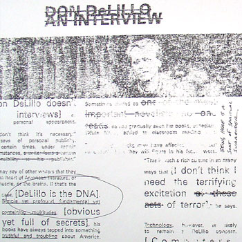
Journal Layout. For Graduate Typography, designing and laying out six pages of a fake journal. We got to choose the content, so mine is a literary journal whose theme is “20 Years of Don DeLillo’s White Noise.”
In an update on December 2004, Dan shares his work:
Above is an image from my final typography project: two spreads and the front and back cover of a fake literary/arts journal called Cadence. I chose the 20th anniversary of White Noise, Don DeLillo’s National Book Award-winning novel, as my subject matter.
The project was to come up with a “font” in which any letter can morph into any other letter. Mine is a “block and bubbles” alphabet, composed of bubbles inside blocks that move around. I tried (unsuccessfully) to get the bubbles to break out of the blocks while moving, but I never got it to work right.
We’ll be creating a poster about a place we’ve never visited. It can be a real or imaginary place.
The poster is supposed to be very impressionistic. That is, we’re not to get images of the actual place, but instead gather images and words about the texture, smell, architecture, and culture of the place. How we imagine it to be.
I’ve chosen a place I’ve always wanted to visit but have never gotten around to it: Iceland.
It’s a multi-tiered project that just starts with creating a type treatment of an onomatopoetic word in a 20″x20″ square. Words like “wow” or “hiss” or “plop.” My word, if the title of this post hasn’t already given it away: booYAH!
Dan Saffer, September 24, 2004
To recap, this poster involved combining an onomatopoetic word (pop, wow, zap) with another word and an image. The three things together were supposed to make some sort of statement. Mine is, not surprisingly, political.
Another experiment by John Maeda, carried it out in 1996 (his first year of teaching computational design at the MIT Media Lab). Described in his book Creative Code (2004, p. 217):
I always wonder what a session with a panel of experts at a conference achieves. Having been on many and hosted a faire share of them, I decided to put students on the spot by making them experts in an impromptu schedule of panels. This role-playing activity forced students to contribute their own perspectives.
Thompson describes the project at 15 minutes into the podcast:
I wanted a project that they could really sink their teeth into, completely wrap their head around and by the end of the semester, fully explain and articulate every design decision that they made. So, the OS project actually starts in Intermediate Interactive, it’s the last project in that class and it’s a five week long project where all they do is they design a universal operating system for smart-phones, tablets, desktops and laptops and video game consoles.
They effectively invent this concept and they use Photoshop and Illustrator to design the user interfaces for all of them.There are some specific caveats on what screens I want to see. Then they put all of that work into a presentation and we present it at the Youngstown Business Incubator. And we also globally live-stream those presentations so I really put the pressure on the students to excel here.
Here’s the live stream where students present their concepts (static mockups):
The Live Stream of the 2016 presentation
That’s only the first part. The project goes on:
They have to create a few different prototypes of their OS project. So generally, students create what I call a non-controlled walk-through. So they use Adobe Animate and they use the work that they had done previously with the OS project and they create a non-controlled walk-through of their operating systems, so boot up, type in your log-in, welcome screen loads, desktop loads, open a program, articulate a task in that program, close it and then shut down the OS. That’s the whole sequence and it could take a minute, it could take five minutes; it’s really up to student and what their narrative is.
Some of the non-controlled walk-throughs
The next step:
The non-controlled walk through leads to a controllable walk-through where we use Adobe XD and in some cases we use InVision. I leave that up to the students to determine which tool is best for them, but effectively they create a clickable walk-through, so we sit people down in front of an operating…an OS project and say, OK, here’s your task: you need to turn it on, log in, open a program, close the program and then close the OS. So, we bring in people to test.
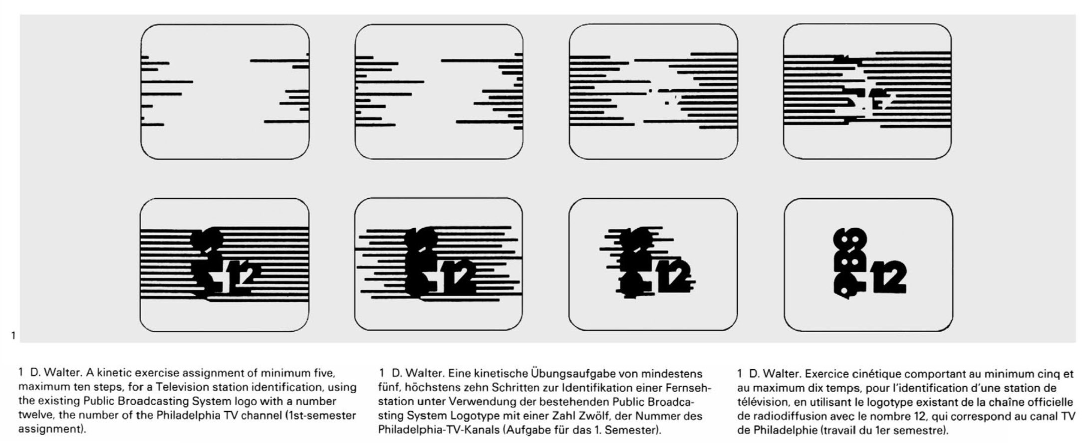
An assignment found in a 1981 program of the Communication Design course, by Hans-Ulrich Allemann, at Philadelphia College of Art:
A kinetic exercise assignment of minimum five, maximum ten steps, for a Television station identification, using the existing Public Broadcasting System logo with a number twelve, the number of the Philadephia TV channel (1st-semester assignment).
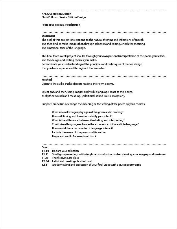
A motion design assignment by Chris Pullman, published in 2014 on his website, given at the Graphic Design Masters Program at Yale.
One of the projects I assign, near the end of the semester, involves the visualization of poetry. I offer my students four or five audio files of poets reading their own poems. I ask them to listen to them all, then select one to work with.
He points out the objective of this assigment:
The objective is to shift the designer’s thinking from “composition” (getting all the elements into just the right spot and freezing them) to “choreography” (planning the path and behavior of multiple elements within the same time space).
An idea for a UX design assignment that emerged while listening to the Wireframe podcast Episode 2 of Season 3, where Miriam Johnson asks:
Now, imagine this: you’re tasked with designing a music app that is specifically for seniors, and you had no idea how to do that, and you’d never done anything like it before.
Miriam Johnson, at 10:50
The podcast features an interview with Sophie Kim, a product designer at Studio Red, about how she worked on an app called Octave, where the typical user is 65 years old and passionate about classical music.