This assignments is based on a blog post by WordPress theme designer Rich Tabor: Exploring WordPress as a design tool (December 2022). Rich writes:
Last week I challenged myself to take one pattern, from one theme, and morph it multiple times — only using the design controls block editor. It’s kind of like CSS Zen Garden, but without CSS — just out-of-the-box WordPress block design tooling.
One theme. One pattern. Seven ways. No additional blocks, nor custom CSS between scenes — just designing in the good ol’ WordPress block editor.
Every font family/size, color, border, radius, image, video, and spacing value were are all added in-editor.
Create a new emoji character. Go through a brainstorming process to come up with useful new emoji types. Design them, in the style of different emoji / OS alphabets (Google, Twitter, OpenMoji…).
An assignment by David Reinfurt, from his Advanced Graphic Design at Princeton University. Reinfurt describes this assignment in the liner notes for an exhibition of student work, held at Hurley Gallery, Lewis Arts complex, in 2017:
The assignment is simple and lasts the full semester — design a new face for the apple watch which tells the time, and (by design) also changes the way you *read* the time. Simple, no? The students begin by considering, with a broad historical scope, how the representation of time affects the ways we understand it and use it.
The “The 1,000 Floor Elevator” is an infamous Interview Design Challenge by Google: “How do you design an interface for a 1000 floors elevator?”.
How do you design an interface for a 1000 floors elevator?
As a 2005 student assignment at CMU
The question has also made appearances in design curricula. Dan Saffer included it among a series of simple, foundational exercises “Five Easy Pieces” at the start of his 2005 Visual Interface Design class (at CMU). This is how he formulates the exercise:
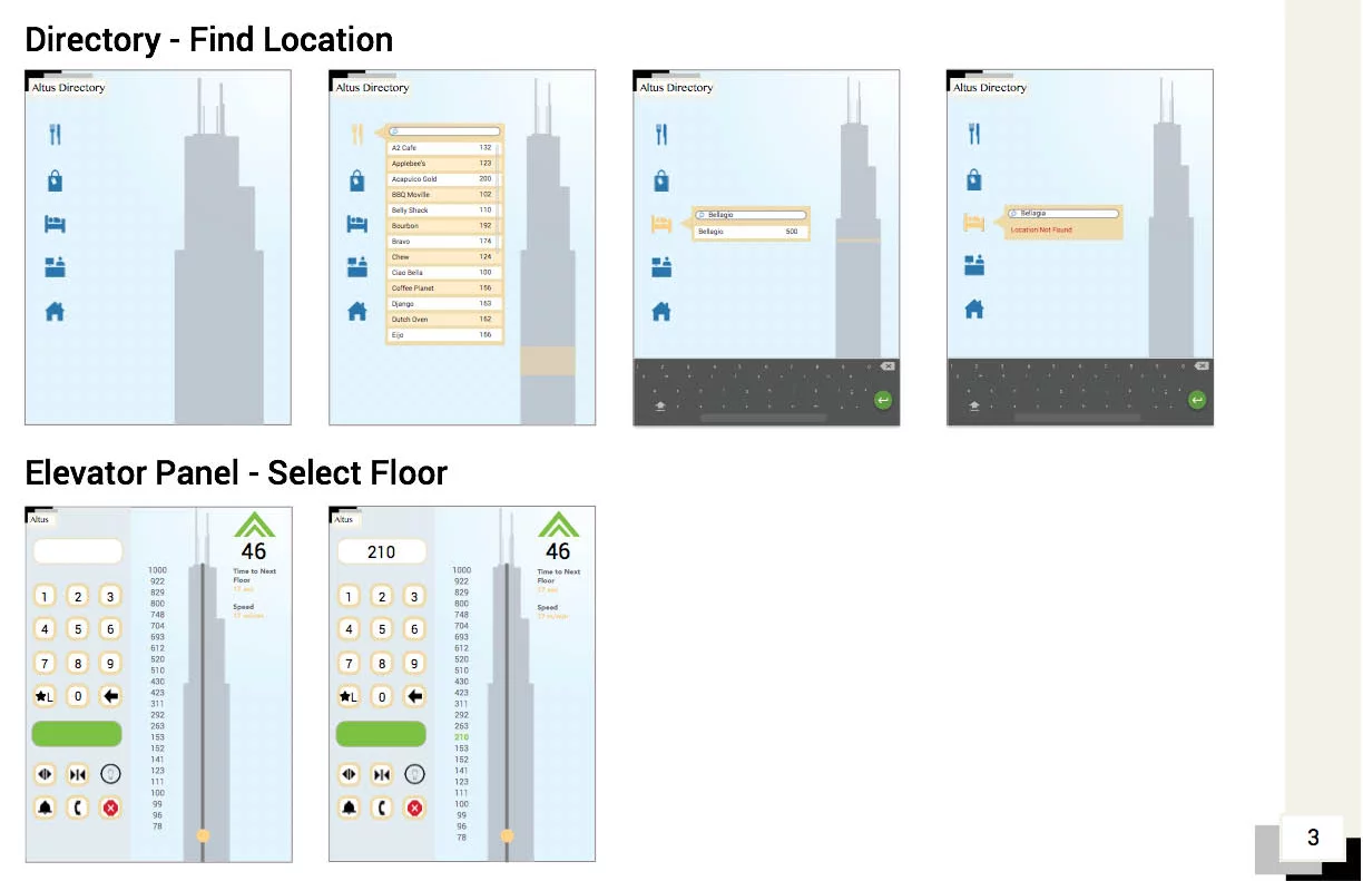
Design an elevator for a building with 1000 floors. Not an elevator system, a single elevator that can travel from the ground floor to the 1000th floor. I expect you to address at least the following: – How a user selects a floor – How the floors are displayed to those in the elevator Your solution should be printed out and mounted on thick black paper for presentation. [Courtesy John Zimmerman]
As a student assignment at CCA
Other iterations of this assignment were given at CCA (California College of the Arts) as part of IxD Studio Foundations.
Over the course of 1 week, we had a design challenge to come up with an elevator interface that services 1000 floors in a building. The prompt states that the building is for mixed retail, commercial and residential inhabitants. Additionally, we must consider how a rider selects a floor, how progress and floors are displayed, and how to access a secure floor. Given this was my first assignment in the program, I learned a lot more about how interaction models work together in an ecosystem.
Thompson describes the project at 15 minutes into the podcast:
I wanted a project that they could really sink their teeth into, completely wrap their head around and by the end of the semester, fully explain and articulate every design decision that they made. So, the OS project actually starts in Intermediate Interactive, it’s the last project in that class and it’s a five week long project where all they do is they design a universal operating system for smart-phones, tablets, desktops and laptops and video game consoles.
They effectively invent this concept and they use Photoshop and Illustrator to design the user interfaces for all of them.There are some specific caveats on what screens I want to see. Then they put all of that work into a presentation and we present it at the Youngstown Business Incubator. And we also globally live-stream those presentations so I really put the pressure on the students to excel here.
Here’s the live stream where students present their concepts (static mockups):
The Live Stream of the 2016 presentation
That’s only the first part. The project goes on:
They have to create a few different prototypes of their OS project. So generally, students create what I call a non-controlled walk-through. So they use Adobe Animate and they use the work that they had done previously with the OS project and they create a non-controlled walk-through of their operating systems, so boot up, type in your log-in, welcome screen loads, desktop loads, open a program, articulate a task in that program, close it and then shut down the OS. That’s the whole sequence and it could take a minute, it could take five minutes; it’s really up to student and what their narrative is.
Some of the non-controlled walk-throughs
The next step:
The non-controlled walk through leads to a controllable walk-through where we use Adobe XD and in some cases we use InVision. I leave that up to the students to determine which tool is best for them, but effectively they create a clickable walk-through, so we sit people down in front of an operating…an OS project and say, OK, here’s your task: you need to turn it on, log in, open a program, close the program and then close the OS. So, we bring in people to test.
An assignment in User Interface Design, by Prof. Claudia Jacques, at Bronx Community College.
Identify what is bad interface design, navigation, functionality, interactivity, content distribution in a website or app and find a positive solution to that site.
An assignment by Boris Müller, Professor for Interaction Design at FH Potsdam
In 2017, I gave a web design class at the Interface Design Programme in Potsdam, Germany. Each team was asked to come up with a redesign for an existing website. The assignment was very clear: Treat the browser as a blank canvas and create expressive, imaginative visual experiences. Use the technological potential of current web technologies as a channel for your creativity. Do not be constrained by questions of usability, legibility, and flexibility. Have an attitude. Disregard Erwartungskonformität.
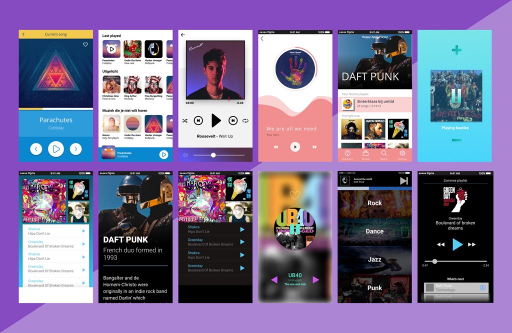
A brief created by Hike One, a digital product design company from the Netherlands:
We gave 32 of our designers the assignment to create a music app in 20 minutes, in teams of 4. Every group was provided with a set of basic music icons and some music related imagery that gave them a head start.