Categories
briefs

Take part in IxDA Student Design Charette

Ask the students to take part in the IxDA Student Design Charette.

The term “charette” evolved from a pre-1900 exercise at the Ecole des Beaux Arts in France. Architectural students were given a design problem to solve within an allotted time. When that time was up, the students would rush their drawings from the studio to the Ecole in a cart called a charrette. (…) Today it refers to a creative process akin to visual brainstorming that is used by design professionals to develop solutions to a design problem within a limited timeframe.

Julia Corrin, Carnegie Mellon University Library
  • Study the brief.
  • Develop an idea.
  • Produce a video presenting it (under 4 minutes).

Website: https://www.sdc.ixda.org/

Some of the previous briefs:

2022 brief: explore how rethinking systems can enable cultures of inclusion and equity
“You are challenged to select either education or the workplace as a focus, identify interesting or provocative use cases, and propose new systems to address a barrier that your use case illustrates. (…) Design an experience (it can be a product, service, or program) that illustrates for the SDC judges and IxDA community how someone’s life can be impacted positively by the shift in your new system. The goal is less about solving a specific problem and more about proposing how to address biases, assumptions, and barriers that marginalize participation and inclusion.”
https://www.sdc.ixda.org/design-brief-22

2021 brief: Our Data and Global Wellbeing
“How might we achieve greater collective wellbeing through the power of our individual data? What might data about us, as individuals, contribute as part of global initiatives for the good of society? You are challenged to explore issues of global health and wellbeing, identify interesting or provocative use cases, and design for the outcomes our 21st century world demands, through transparent, empowered, participation with data.” (source)

Video of the 2021 design charette, the topic: “Our Data & Global Wellbeing”. The winning team, PulseAir, decided to focus on the negative health effects of air pollution.

The 2020 brief, sponsored by Amazon Design: Using voice to create empowering moments
“How might voice experiences improve the lives of people facing unique challenges? More specifically, how can Alexa better address the needs of the deaf, blind, disabled, or neuro-diverse? We want to hear your ideas for new devices or services that can empower those who may need it the most”. (source)

The 2019 brief, sponsored by Microsoft Design, on the theme of Empathy: “Design an experience (this can be a product, service, or program) that allows (…) to better understand a day in the life of someone with misunderstood or ignored differences” (source)

The 2018 brief, sponsored by Microsoft Design, focuses on one of the United Nations’ 17 Sustainable Development Goals: “Quality Education”. (source)

The 2017 brief, sponsored by Intel, had the theme “Everyday Magic”. “We want you to look at the everyday life that surrounds you and how, through design and the creative use of new technologies, you can make it a magical”. (source)

The 2016 brief, sponsored by SapientNitro and written by Daniel Harvey, had the theme: “The Future we deserve”. “Each day of our lives, we depend on services — from buses to traffic systems, sanitation to healthcare — to survive and thrive in the places we live. What would five years look like, if you could shape public services by tapping the opportunities we have at our disposal today that we wouldn’t have been able to achieve in the past?” (source)

The 2015 brief had the theme “Envisioning the Wearable City”: “What if you could imagine new ways for people to connect to their city through wearable technology — to improve their life and their city? What would you measure or share? What problems would you solve? What new relationships between you and your environment would you facilitate?” (source)

The 2014 challenge had the theme of “child health records”.

The 2013 challenge had the theme “Playful Technology”
Categories
ideas

The 1000 Floor Elevator

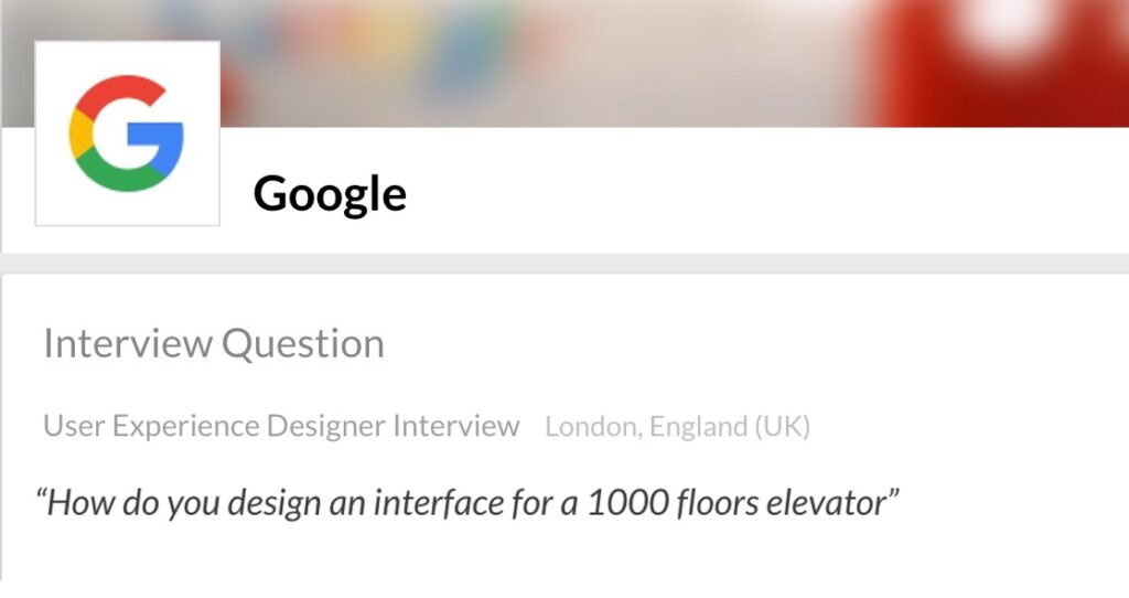
The “The 1,000 Floor Elevator” is an infamous Interview Design Challenge by Google: “How do you design an interface for a 1000 floors elevator?”.

How do you design an interface for a 1000 floors elevator?

As a 2005 student assignment at CMU

The question has also made appearances in design curricula. Dan Saffer included it among a series of simple, foundational exercises “Five Easy Pieces” at the start of his 2005 Visual Interface Design class (at CMU). This is how he formulates the exercise:

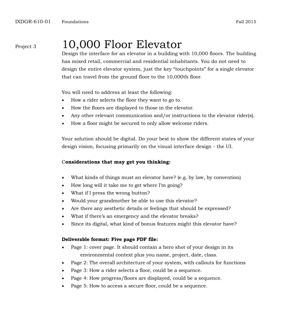
Design an elevator for a building with 1000 floors. Not an elevator system, a single elevator that can travel from the ground floor to the 1000th floor. I expect you to address at least the following:
– How a user selects a floor
– How the floors are displayed to those in the elevator
Your solution should be printed out and mounted on thick black paper for presentation.
[Courtesy John Zimmerman]

As a student assignment at CCA

Other iterations of this assignment were given at CCA (California College of the Arts) as part of IxD Studio Foundations.

In 2011, William Clark published his version on his Behance profile, mentioning that “This was our first challenge in CCA’s Intro to IxD class”.

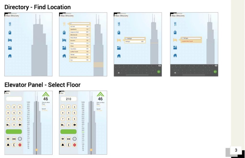
In 2015, designer Kristine Yuen shows the results in her portfolio. This is her description of the assignment:

Over the course of 1 week, we had a design challenge to come up with an elevator interface that services 1000 floors in a building. The prompt states that the building is for mixed retail, commercial and residential inhabitants. Additionally, we must consider how a rider selects a floor, how progress and floors are displayed, and how to access a secure floor.
Given this was my first assignment in the program, I learned a lot more about how interaction models work together in an ecosystem.

Further reading

Some articles on this design challenge:

Categories
briefs

Operating System Project

An assignment by R.J. Thompson, discovered while listening to episode 51 of the DesignEduToday podcast. This project fills an entire semester in Graphic & Interactive Design at Youngstown State University.

Thompson describes the project at 15 minutes into the podcast:

I wanted a project that they could really sink their teeth into, completely wrap their head around and by the end of the semester, fully explain and articulate every design decision that they made. So, the OS project actually starts in Intermediate Interactive, it’s the last project in that class and it’s a five week long project where all they do is they design a universal operating system for smart-phones, tablets, desktops and laptops and video game consoles.

They effectively invent this concept and they use Photoshop and Illustrator to design the user interfaces for all of them.There are some specific caveats on what screens I want to see. Then they put all of that work into a presentation and we present it at the Youngstown Business Incubator. And we also globally live-stream those presentations so I really put the pressure on the students to excel here.

Here’s the live stream where students present their concepts (static mockups):

The Live Stream of the 2016 presentation

That’s only the first part. The project goes on:

They have to create a few different prototypes of their OS project. So generally, students create what I call a non-controlled walk-through. So they use Adobe Animate and they use the work that they had done previously with the OS project and they create a non-controlled walk-through of their operating systems, so boot up, type in your log-in, welcome screen loads, desktop loads, open a program, articulate a task in that program, close it and then shut down the OS. That’s the whole sequence and it could take a minute, it could take five minutes; it’s really up to student and what their narrative is.

Some of the non-controlled walk-throughs

The next step:

The non-controlled walk through leads to a controllable walk-through where we use Adobe XD and in some cases we use InVision. I leave that up to the students to determine which tool is best for them, but effectively they create a clickable walk-through, so we sit people down in front of an operating…an OS project and say, OK, here’s your task: you need to turn it on, log in, open a program, close the program and then close the OS. So, we bring in people to test.

Ometsys OS Controlled Walkthrough

Links

Categories
briefs ideas

A music app for seniors

An idea for a UX design assignment that emerged while listening to the Wireframe podcast Episode 2 of Season 3, where Miriam Johnson asks:

Now, imagine this: you’re tasked with designing a music app that is specifically for seniors, and you had no idea how to do that, and you’d never done anything like it before.

Miriam Johnson, at 10:50

The podcast features an interview with Sophie Kim, a product designer at Studio Red, about how she worked on an app called Octave, where the typical user is 65 years old and passionate about classical music.

Categories
briefs

design tools survey

An assignment by Manuel Schmalstieg at EAA La Chaux-de-Fonds. The students had to produce a survey of tools and methods used in a professional field.

A class of Interactive Design students created a “2018 survey” of design tools used by digital agencies, in Switzerland and France.

The tasks involved:

  • Defining the questions of the survey.
  • Selecting an online survey tool (we chose Typeform)
  • Building a contact list to mail out the survey.
  • Creating a Mailchimp newsletter to send out the survey and allow for follow-up.
  • Designing a visual concept for the presentation of the survey results (we used Figma).
  • Coding the website.

Time available: 28 hours (in 7 sessions).

The initial brief: https://github.com/eaa-imd/designtools

The resulting website: https://eaa-imd.github.io/designtools/

Categories
briefs workshops

8 hour UX workshop

An assignment by Meylin Bayryamali, for a UX workshop at ISCOM Paris, a prestigious business school.

I divided the 62 students into groups of 4 (2 groups of 5). Every group had to deliver a prototype of either an online shop or dog sitting website.

The students had to deliver: personas, user flows and 5 pages prototype of a desktop website.

Source: https://uxdesign.cc/figma-in-the-classroom-439814cd9e6d

Categories
briefs

Worst of the Web

An assignment in User Interface Design, by Prof. Claudia Jacques, at Bronx Community College.

Identify what is bad interface design, navigation, functionality, interactivity, content distribution in a website or app and find a positive solution to that site.

Source: http://bccart87.claudiajacques.com/project-1-worst-of-the-web/

Categories
briefs

Future Retro

An assignment by Boris Müller, Professor for Interaction Design at FH Potsdam

In 2017, I gave a web design class at the Interface Design Programme in Potsdam, Germany. Each team was asked to come up with a redesign for an existing website. The assignment was very clear: Treat the browser as a blank canvas and create expressive, imaginative visual experiences. Use the technological potential of current web technologies as a channel for your creativity. Do not be constrained by questions of usability, legibility, and flexibility. Have an attitude. Disregard Erwartungskonformität.

The results: https://interface.fh-potsdam.de/future-retro/

Source: Why Do All Websites Look the Same?, Medium, Oct 30 2018