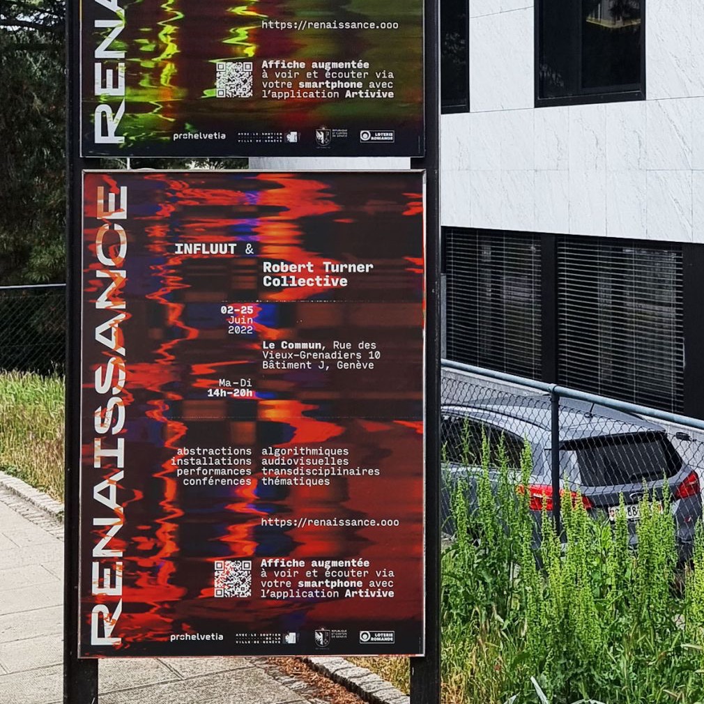
When working in the non-english-speaking world, it’s a common scenario that a typeface used for a design is missing a small number of diacritics or glyphs used in a specific language – german, icelandic, norse, polish…
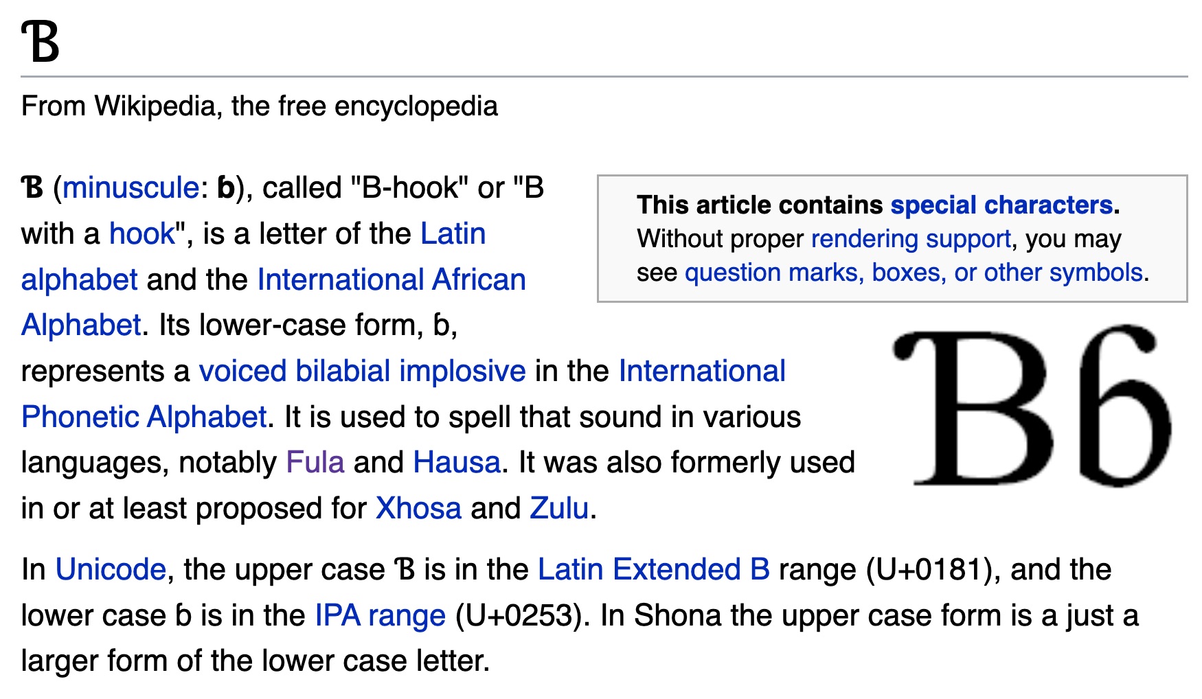
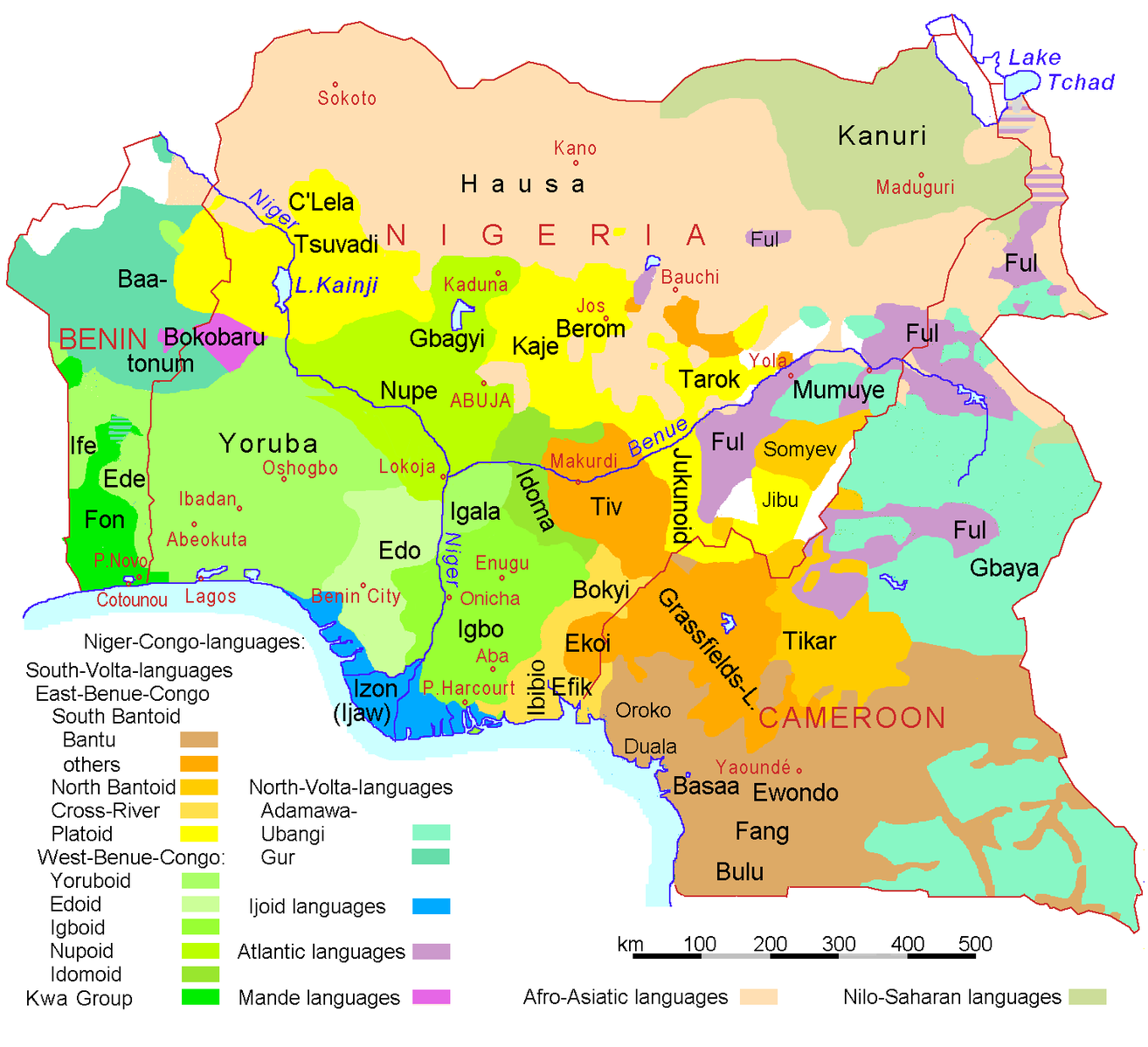
A language that uses the latin alphabet “plus some special characters” is the Pan-Nigerian alphabet. By adding those characters to a font that was missing them, the font becomes usable for millions of people. Nigeria has a population of approximately 216.7 million, speaking over over 525 native languages.
Character support of some Google Fonts
In this exercise, students receive the task to make an open-source font available for the Nigerian native languages, by adding the missing characters.
The list of glyphs needed:
Ɓ / ɓ = (U+0181 and U+0253) (aka uni0181, uni0253)
The first edition of Genuary was launched in January 2021: the website genuary2021.github.io provided 31 prompts – 1 per day – to invite participants to “make beautiful things with code”.
GENUARY aims to make it possible for people to do 31 daily prompts, one every day, during that day.
it started in Inktober, when a couple of generative artists remarked they found it difficult to apply the prompts of Inktober to generative art. Then I thought I came up with the name “Genuary”
Productions were to be shared on twitter using the hashtag #genuary2021.
Selection of genuary2021 works by Vernon Miller / @Aldernero
Selection of genuary2021 works by @piterpasma
“No Computer”, by Loackme
Some participants documented their creations on a website, such as data scientist Ram Narasimhan (who codes using the Python extension of Processing).
Genuary 2022
Another edition takes place in 2022, the website being genuary.art and the twitter hashtag #genuary2022. Some of the prompts:
Day 1: Draw 10,000 of something.
Day 5: Destroy a square.
Day 6: Trade styles with a friend.
Day 10: Machine learning, wrong answers only.
Day 11: No computer.
Day 16: Color gradients gone wrong.
Day 18: VHS.
Day 21: Combine two (or more) of your pieces from previous days to make a new piece.
Day 23: Abstract vegetation.
Day 24: Create your own pseudo-random number generator and visually check the results.
A github issue collects prompt suggestions for the 2023 edition.
See also: Plot Party
A similar five-day prompt was launched in November 2021 under the name “Plot Party” by the pen plotter community. The prompts were:
Nov 8 – Weather
Nov 9 – Multiple Line Widths
Nov 10 – Glitches (errors/bugs) – “Embrace mistakes, whether in code or during the pen plotting process”
Nov 11 – Postcard – “A postcard sized prompt, make any small, postcard sized work. There is also an optional postcard exchange”
Nov 12 – No Pen – “Forgo a pen for any other tool”
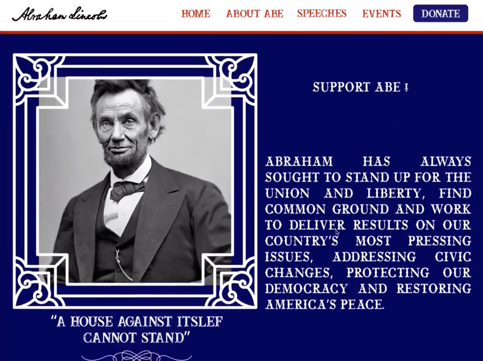
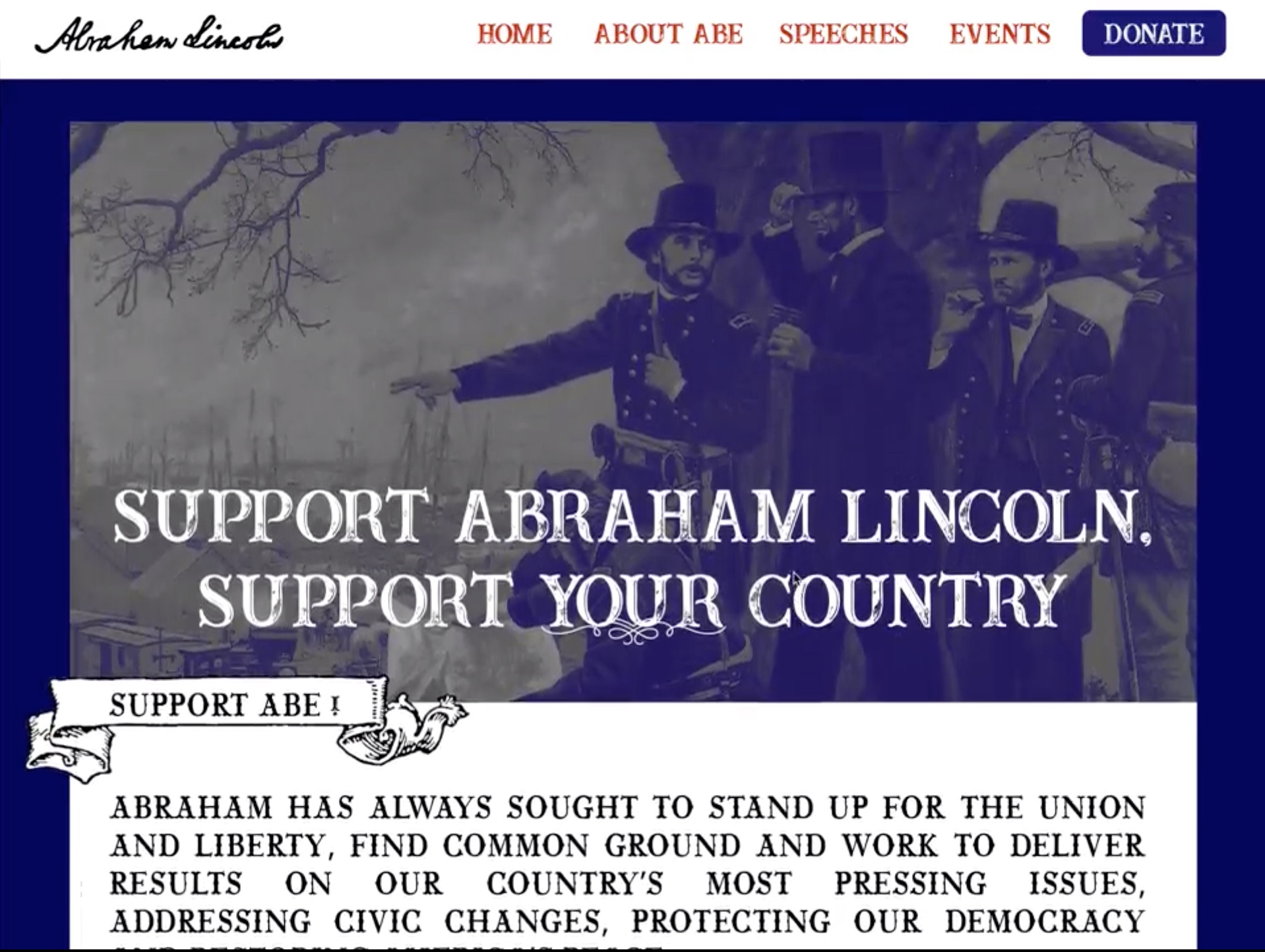
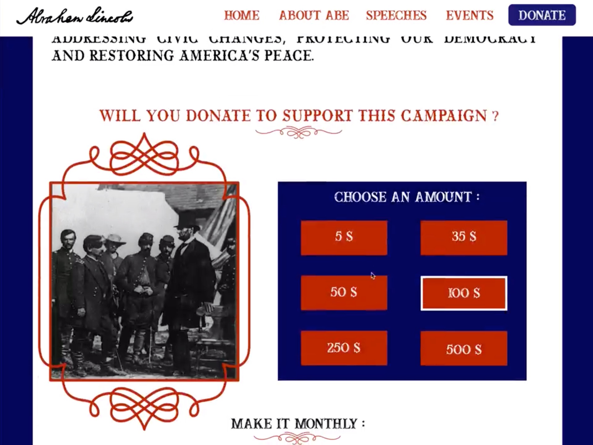
In this brief, students are asked to continue the story by adding a new chapter – how does the current year in web design look like? They will have to identify current design trends, major innovations, notable websites, and organize the information following the examples in the book.
Depending on the number of students, they can work on one year, or on several missing years (2019, 2020, 2021…).
This brief is inspired by this line, by photographer Joséphine Michel, on her collaboration with Mika Vainio:
Écouter tous les matins un de ses albums, puis aller photographier des lieux en correspondance avec sa musique. Dans la nature, ou dans les musées de sciences
Engage students in a tournament of “layer tennis” (also known as Photoshop ping-pong”. According to Wikipedia:
The players pick a starting image, or one is “served” by a player, then another player makes some sort of alteration to the image in any chosen image editor (matches are not exclusive to Adobe Photoshop). They then send the altered image to the other player or players, usually via e-mail or by posting the image to a Photoshop tennis forum, who then edits that image and sends it back to the first player. This process goes back and forth until a predetermined number of rounds have elapsed, or the players otherwise wish to end the game.
My first typographic exercice under Emil Ruder was twenty variations of a small size newspaper ad. Eight of them were shown in November 1961 in Graphisches abc, a german magazine for apprentices of the graphic trade.
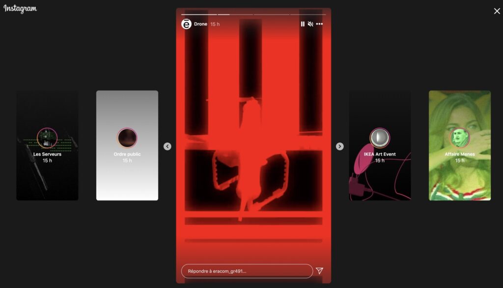
A brief proposed by Frederik Mahler-Andersen : students have to create an Instagram Story, as a series of short animations (combining video, image, text). The topic has to be a news article chosen by the student.
Create a new emoji character. Go through a brainstorming process to come up with useful new emoji types. Design them, in the style of different emoji / OS alphabets (Google, Twitter, OpenMoji…).