Categories
briefs historical

Recreate a label from scratch

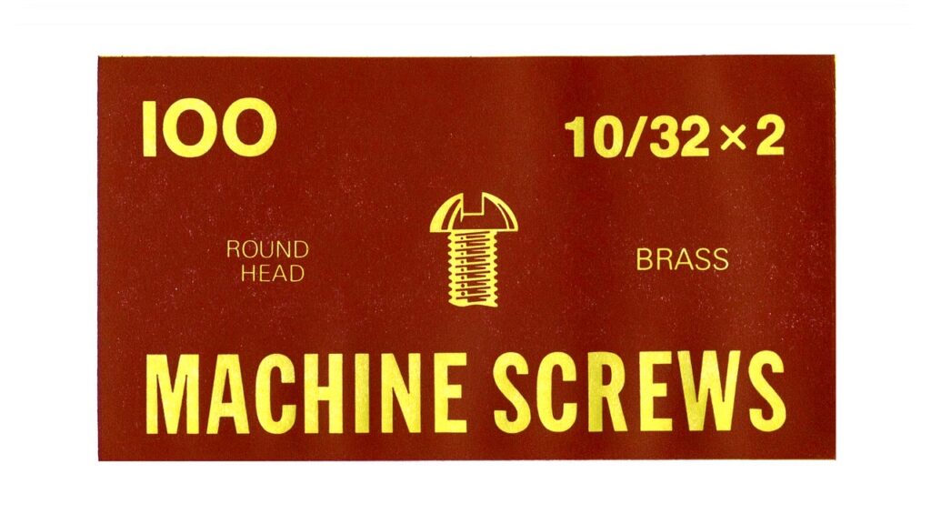
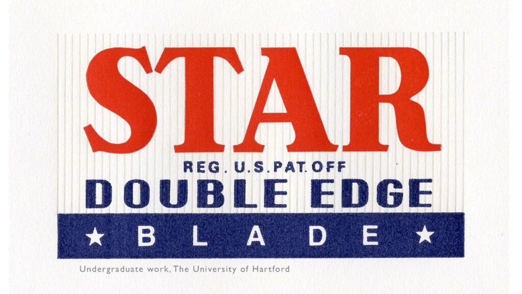
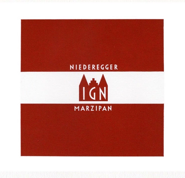
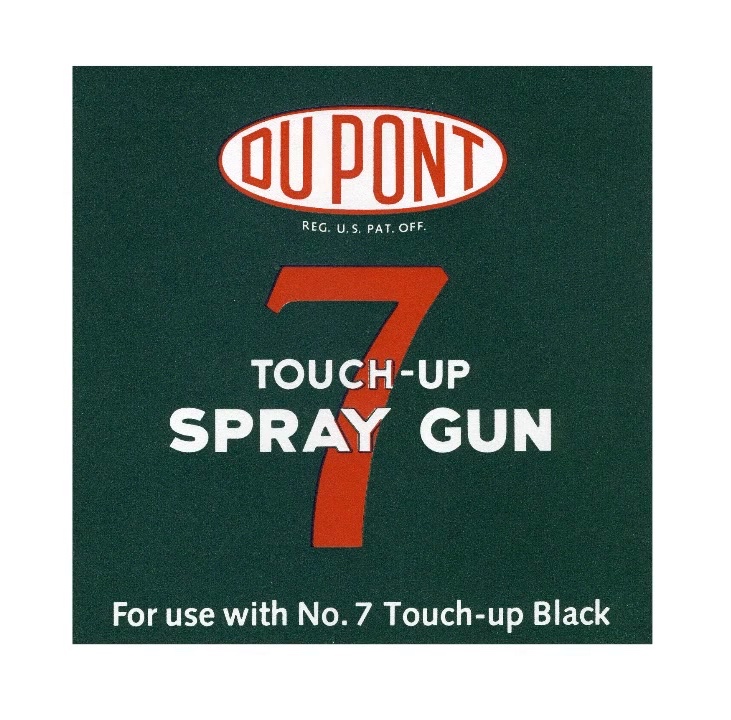
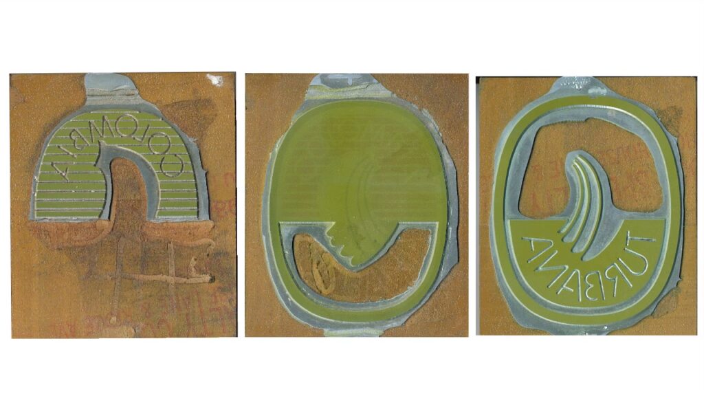
An assignment by Inge Druckrey, described in the movie “Teaching to See” (minutes 7:04 to 8:30):

I had collected over time some beautiful old labels. So I distributed them among the students, and asked them to create a new edition. They had to:

  • recreate the letters on the label.
  • draw any image that appeared on the label.
  • prepare color-separation to have hot metal plates done.
  • mix the ink.
  • print the labels in proper registration on a small letter press.
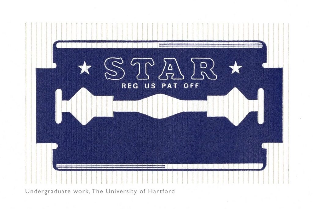
So they learned about designing letters, they matched the letters on the original label, they designed the marks from scratch, carefully matching the same quality. They learned about color separation, how to get the individual colors on separate hot metal plates, about ink mixing, and the printing itself.

And the students loved the project, because it had a clear goal.

Note: the assignment was done before computers became available.

Categories
briefs

Pan-Nigerian Alphabet

When working in the non-english-speaking world, it’s a common scenario that a typeface used for a design is missing a small number of diacritics or glyphs used in a specific language – german, icelandic, norse, polish…

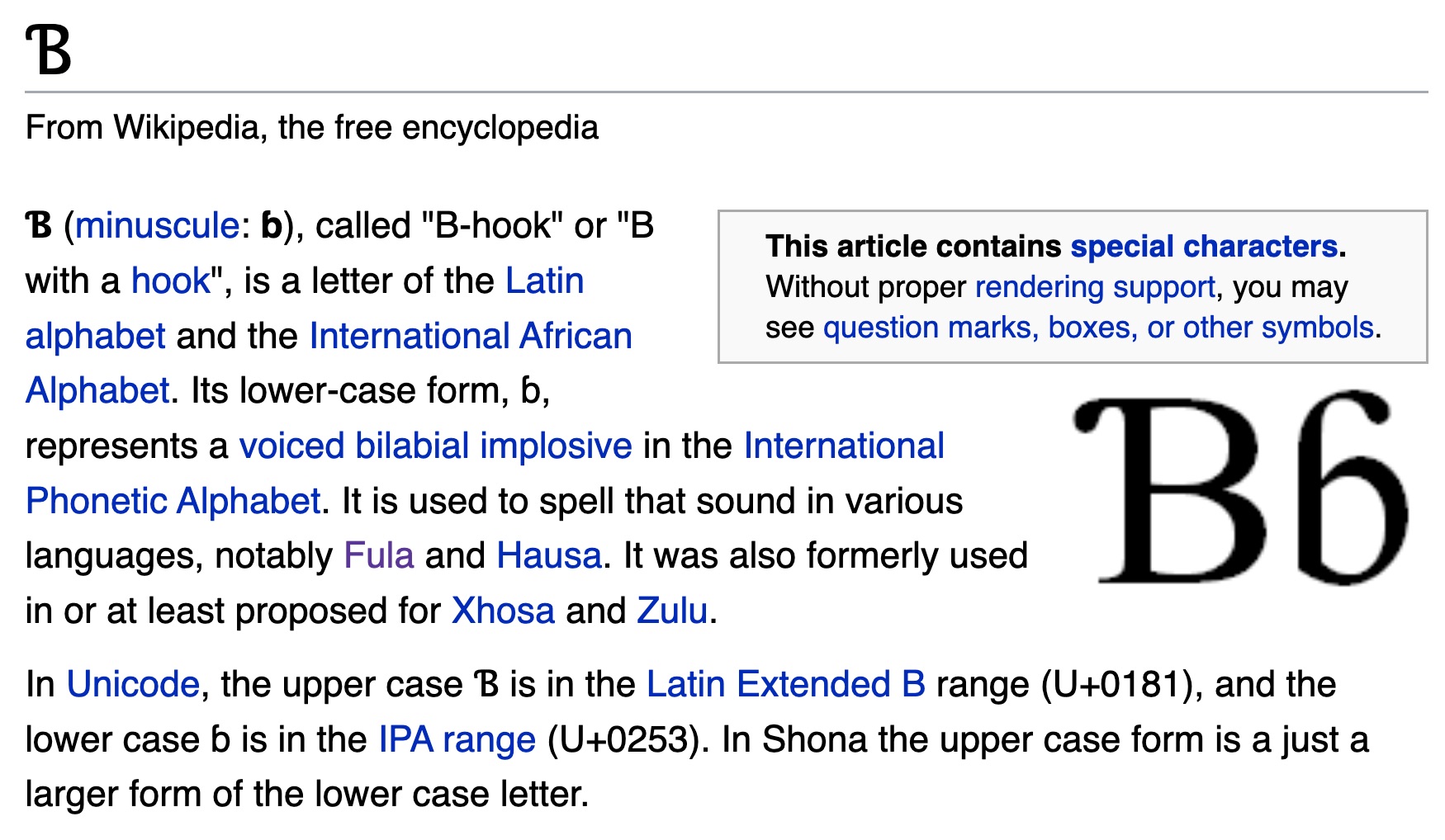
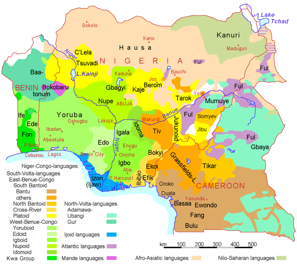
A language that uses the latin alphabet “plus some special characters” is the Pan-Nigerian alphabet. By adding those characters to a font that was missing them, the font becomes usable for millions of people. Nigeria has a population of approximately 216.7 million, speaking over over 525 native languages.

In this exercise, students receive the task to make an open-source font available for the Nigerian native languages, by adding the missing characters.

The list of glyphs needed:

  • Ɓ / ɓ = (U+0181 and U+0253) (aka uni0181, uni0253)
  • Ɗ / ɗ = (U+018A and U+0257)
  • Ǝ / ǝ = (U+018E and U+01DD)
  • Ẹ / ẹ = (U+1EB8 and U+1EB9)
  • Ị / ị
  • Ƙ / ƙ = (U+0198 and U+0199)
  • Ọ / ọ
  • Ṣ / ṣ = (U+1E62 and U+1E63)
  • Ụ / ụ
Categories
briefs ideas

Layer tennis

Engage students in a tournament of “layer tennis” (also known as Photoshop ping-pong”. According to Wikipedia:

The players pick a starting image, or one is “served” by a player, then another player makes some sort of alteration to the image in any chosen image editor (matches are not exclusive to Adobe Photoshop). They then send the altered image to the other player or players, usually via e-mail or by posting the image to a Photoshop tennis forum, who then edits that image and sends it back to the first player. This process goes back and forth until a predetermined number of rounds have elapsed, or the players otherwise wish to end the game.

Ressources:

Categories
historical

twenty variations of a small size newspaper ad

In the 2014/04 issue of TM-RSI, Helmut Schmid writes a recollection:

My first typographic exercice under Emil Ruder was twenty variations of a small size newspaper ad. Eight of them were shown in November 1961 in Graphisches abc, a german magazine for apprentices of the graphic trade.

Categories
briefs

Kinetic Typography

Create a kinetic typography video that accompanies an audio of your choosing.

Found in a student showcase from Elon University: https://feleciawilkins.wixsite.com/portfolio (archive)

In my Visual Aesthetics class, which focused on graphic design principles, we were given the task to complete a kinetic typography video that accompanied an audio of our choosing. I chose the poem titled “The Dream Keeper” by Langston Hughes because I found it to be inspiring and uplifting. 

Each illustration was made in Adobe Illustrator and imported into After Effects afterwards to be animated.

Categories
briefs

Typeset a classic novel

Typeset a classic novel in HTML/CSS. A proposal from Robin Rendle’s newsletter, Adventures in Typography:

If I could go back in time to teach my younger self about typesetting then I reckon that this is where I’d start: “Take your favorite book,” I’d say “and design the absolute heck out of it.”

Let’s say you want to learn how to set type on the web, for example. Then I would argue that it’s more important that you get the fundamentals of typography down first before you go and learn about React or some giant-framework-to-do-app-thing. And the easiest way to learn the fundamentals is copying all the text from To the Lighthouse or Moby Dick or whatever your favorite book happens to be, and throwing it into Codepen. Then you can try and make it all easier to read, slowly, bit by bit.

Categories
briefs

Font Collections

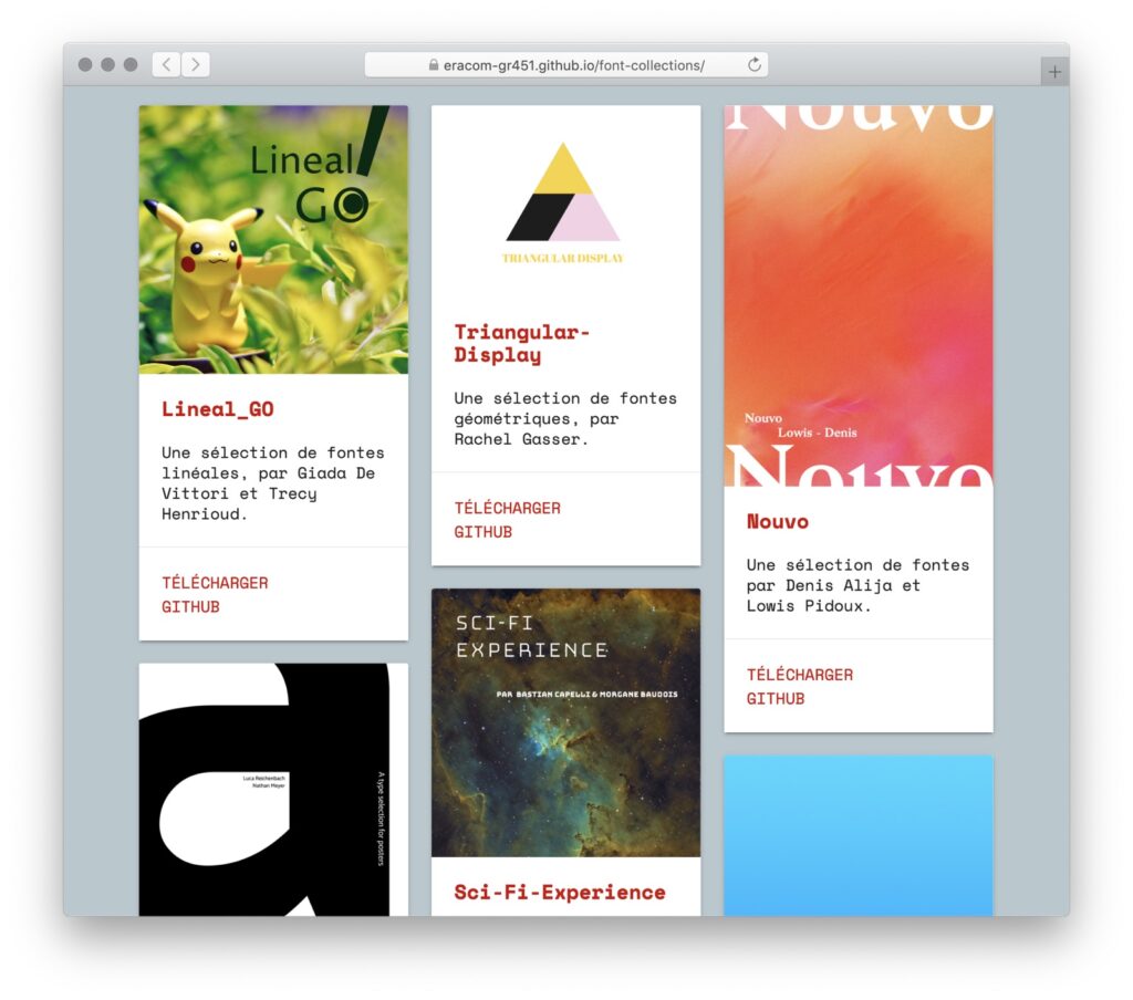
In this assignment, students are asked to create a “Font Collection”: a selection of typefaces related through some concept.

I carried out this assignment during an afternoon (3 hours) in November 2016, at Eracom, Lausanne.

The original project brief can be found here (in French). In short:

Concrètement, chaque groupe aura comme mission de:

  • Sélectionner un ensemble de 10 fontes.
  • Donner un titre à cet ensemble (par exemple: “Ultimate Monospace Type Collection”, “Grotesques et Arabesques”, “Fermentation Belge”, etc). Approchez la chose comme si vous deviez constituer une compilation de musique, une mixtape…
  • Créer un graphique servant de “pochette” à sa collection.
  • Créer un dossier qui contient les fontes (format TTF ou OTF), la pochette (format PNG), et un fichier README.MD avec la liste des 10 fontes, leurs sources, leurs auteurs.
  • Publier la collection sur GitHub.

The results are presented on this site: https://eracom-gr451.github.io/font-collections/

Categories
briefs

specimen books

Source: original brief by Manuel Schmalstieg, February 2013.

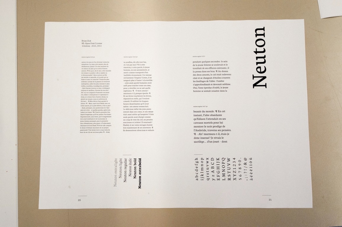
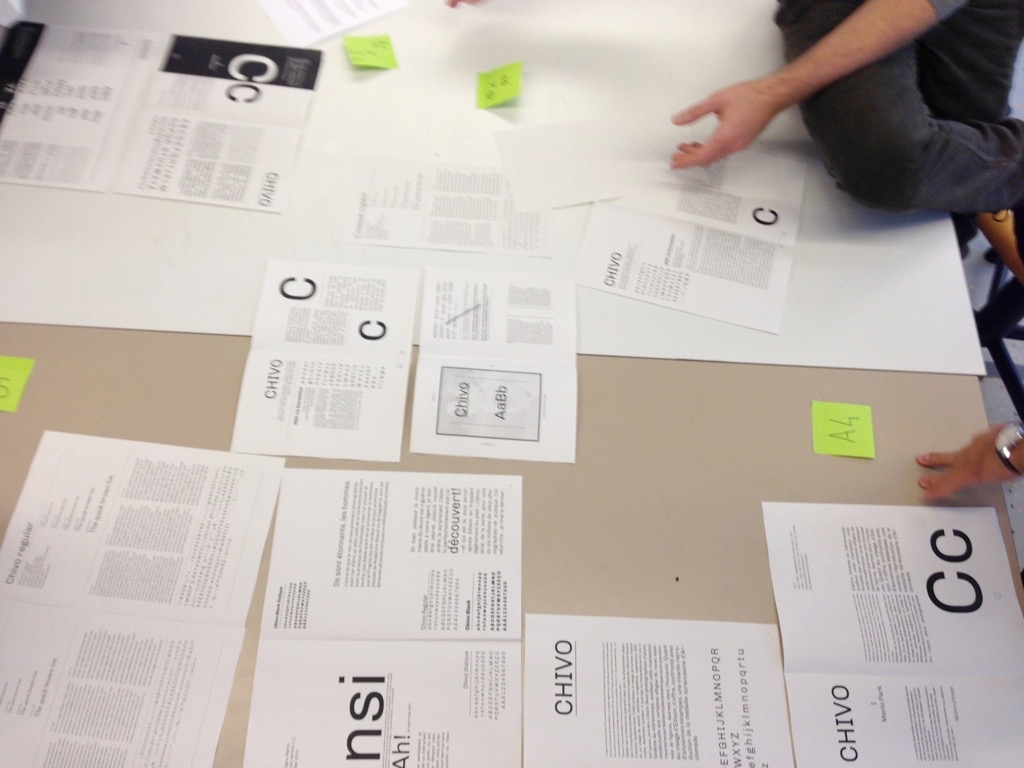
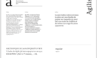
Participants design a specimen book of typefaces. They select a number of interesting typefaces, and create specimen pages. The pages are assembled into a book, which may be published using a print-on-demand service.

Typical steps during this brief:

  • Define the scope of the book: What type of typefaces are to be chosen? How many pages will be produced by each participant? What will be the sample text?
  • Create a specimen template that will be used by each participant. Each student should design a template, and during a critical session one of the template is chosen.
  • Once the template is defined, the students can begin to create the specimens.
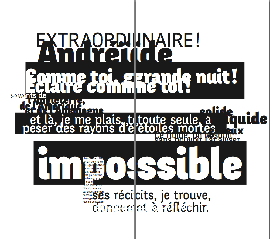
  • In addition to the template-based specimens, each students should design a few pages of freeform, individual specimens where they can to break all rules and display the fonts in unexpected ways.
  • To finish the book, some more things must be designed: cover page, backcover, introduction pages, index.

Bibliography: to give the students a frame of reference and inspiration, it’s a good idea to show them some specimen books. Maybe your school has some of them in the library. A few examples: specimen books by designers (Jean-Baptiste Levée, Radim Pesko), the iPad app of FontFont, the Free Font Index, books by Fred Smeijers…

2 reports for specimen books

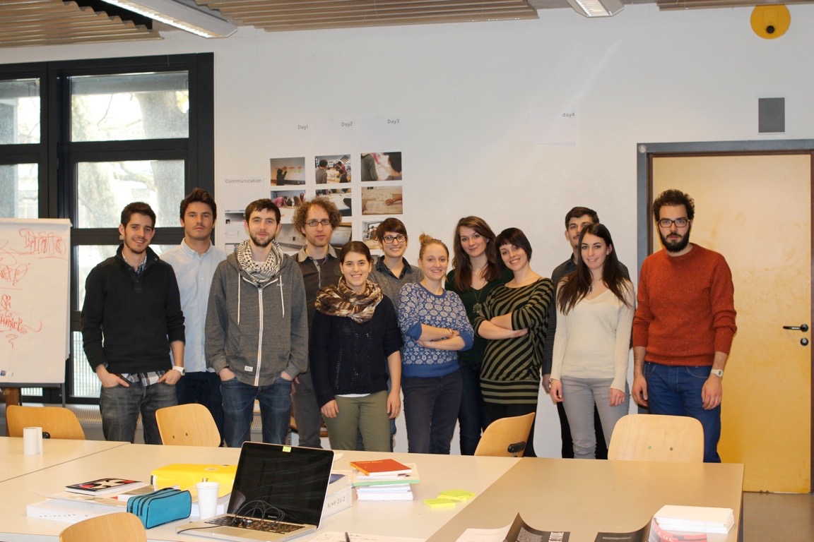
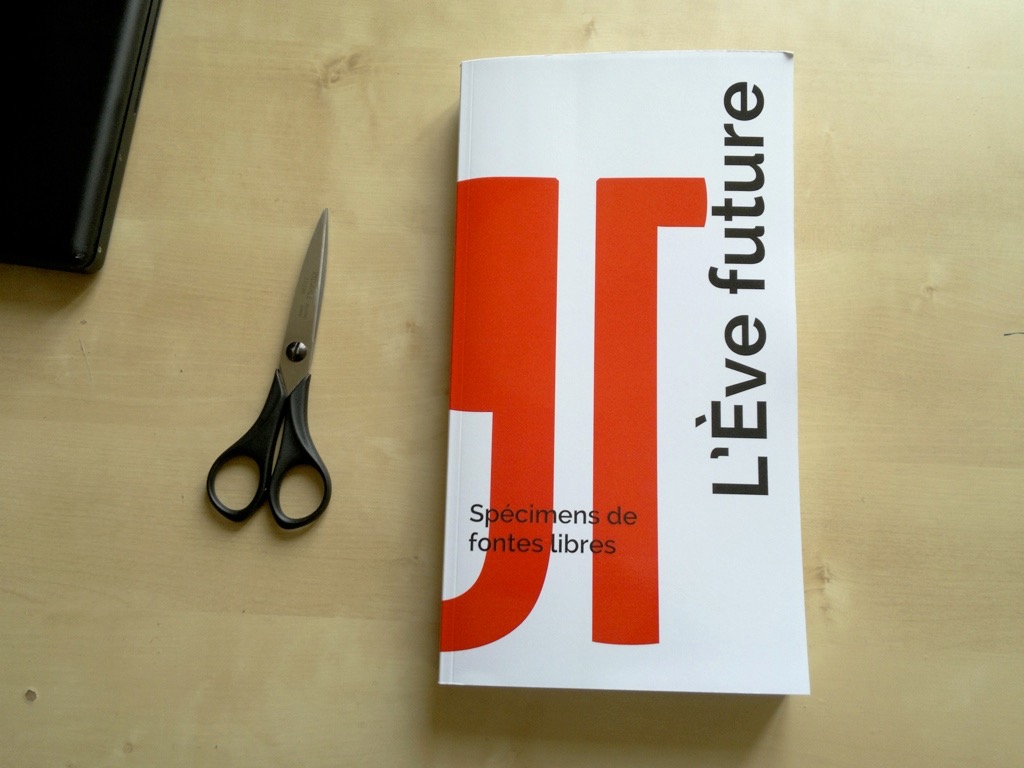
#1 – L’Eve future – HEAD Geneva

First implementation of the “Specimen Books” workshop.
Host institution: HEAD Geneva.
Instructor: Manuel Schmalstieg
Timeframe: 18-22 February 2013, five days (ca 40 hrs).
Students: 11.

#2 – Specimen Books: EAA La Chaux-de-Fonds

Second implementation of the “Specimen Books” workshop.

Host institution: EAA La Chaux-de-Fonds.
Instructor: Manuel Schmalstieg
Timeframe: May 2013, 5 half-day sessions (ca. 20 hrs).

Following the success of the first implementation at HEAD Geneva, I proposed a second iteration of that workshop concept to a class in La Chaux-de-Fonds.

Participants: Olivier Borel, Patricia Monteiro, Anthony Bühler, Lori Droel, Emilie Mojon, Yannick Chautems, Marie Lechot, Quantin Perrenoud.

Some differences compared to the previous workshop:

– Instead of working with Adobe InDesign, students worked with open-source layout software Scribus.
– Instead of one common sample text, students chose a different text for each specimen. The concept: descriptions of films taken from french Wikipedia (the title of the film isn’t revealed).
– The workshop duration was 50% shorter: 20 hours (5 half-day sessions).

Final result: a PDF of 153 pages, gathering 79 specimens. The attempt to produce a print version failed due to time constraints.