When working in the non-english-speaking world, it’s a common scenario that a typeface used for a design is missing a small number of diacritics or glyphs used in a specific language – german, icelandic, norse, polish…
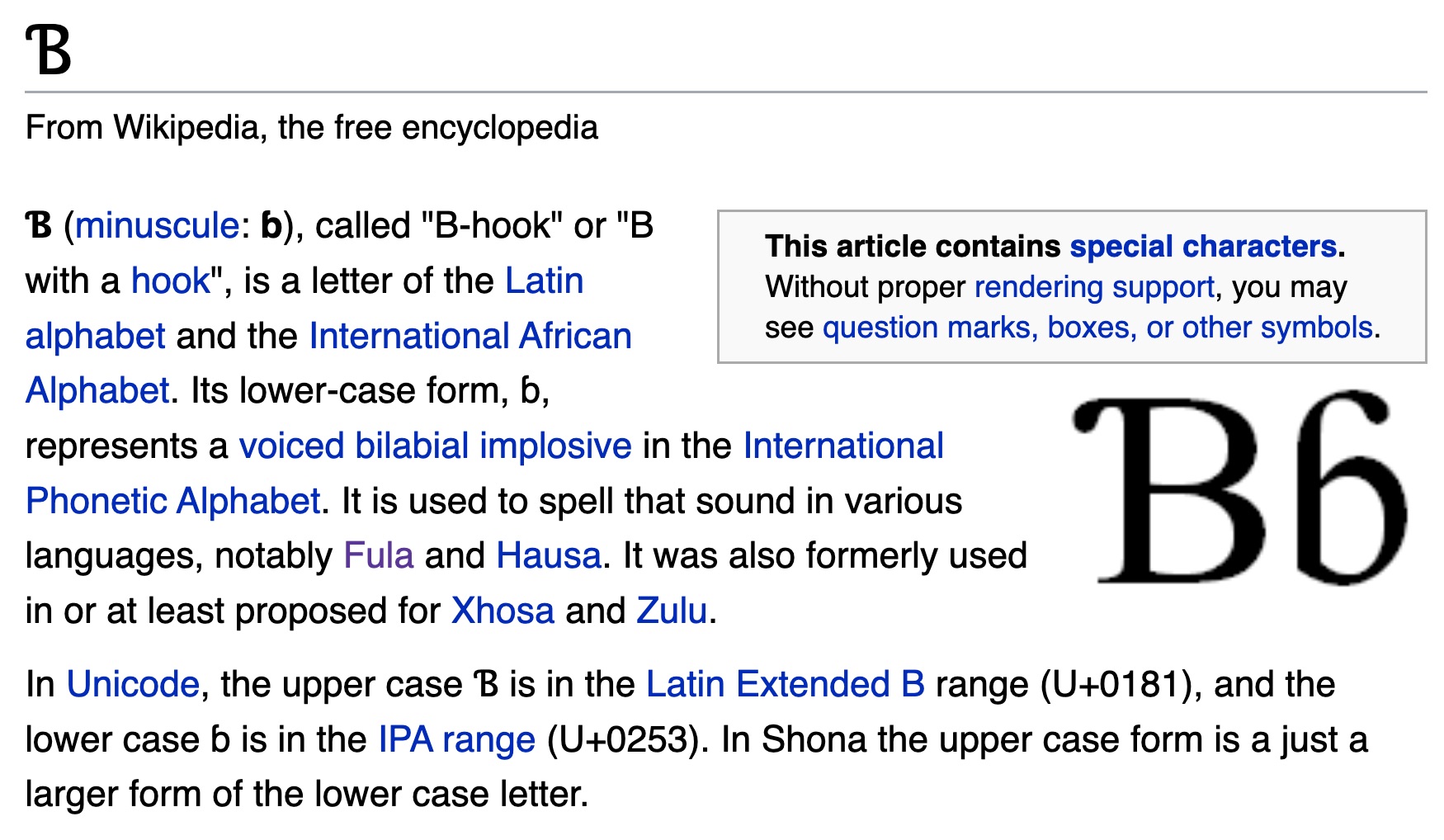
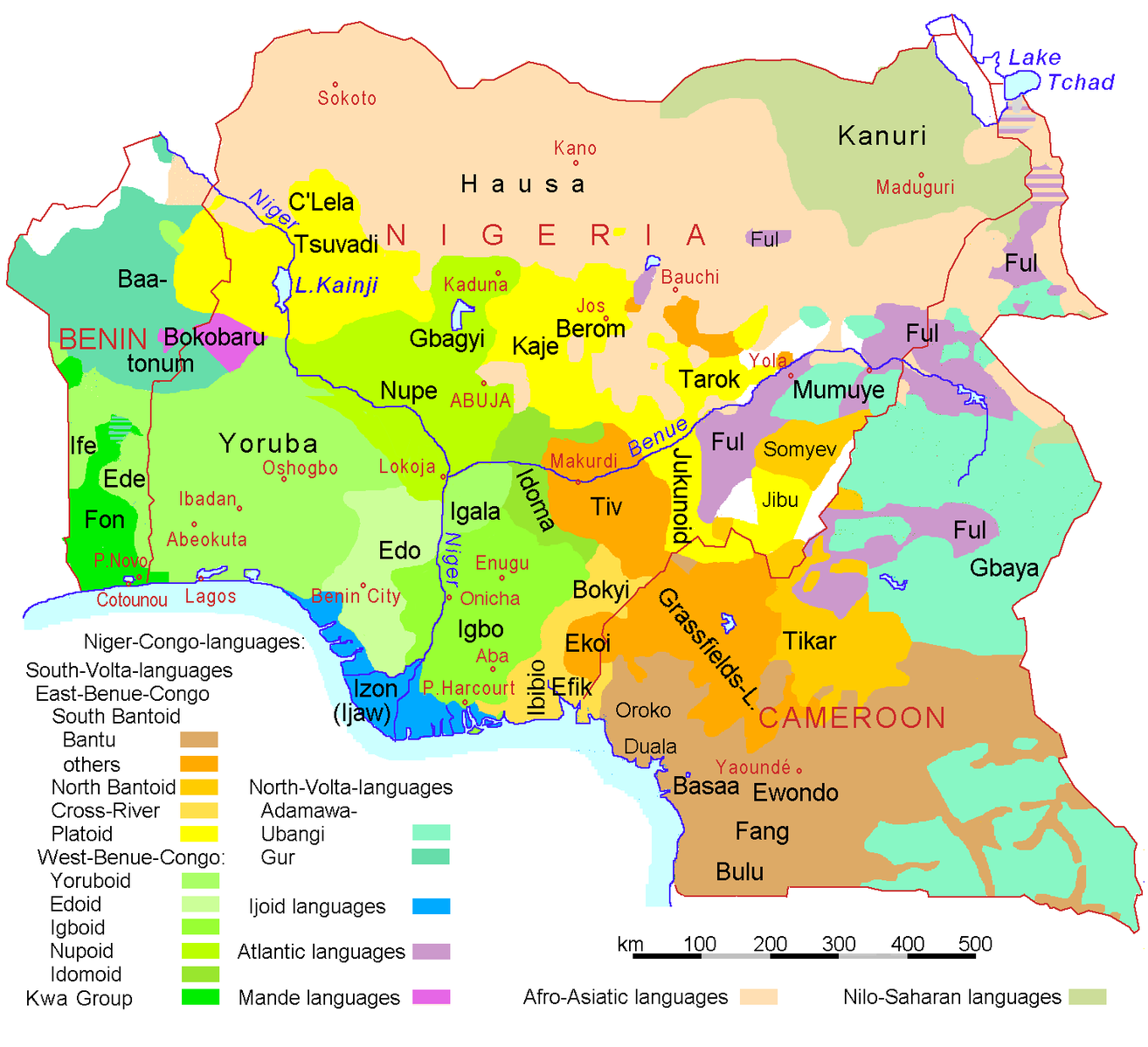
A language that uses the latin alphabet “plus some special characters” is the Pan-Nigerian alphabet. By adding those characters to a font that was missing them, the font becomes usable for millions of people. Nigeria has a population of approximately 216.7 million, speaking over over 525 native languages.
Character support of some Google Fonts
In this exercise, students receive the task to make an open-source font available for the Nigerian native languages, by adding the missing characters.
The list of glyphs needed:
Ɓ / ɓ = (U+0181 and U+0253) (aka uni0181, uni0253)
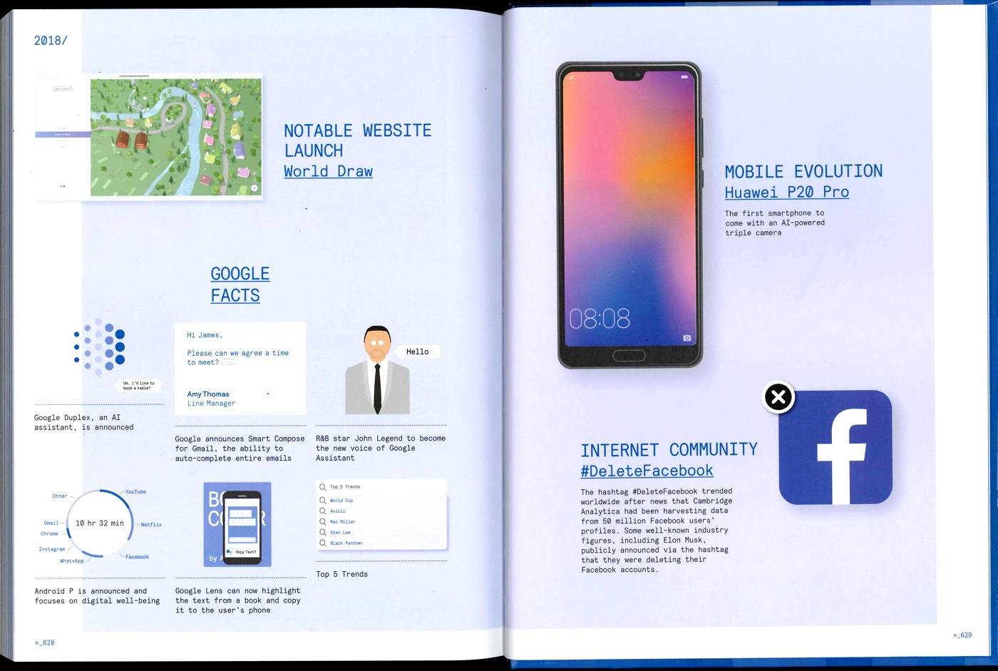
In this brief, students are asked to continue the story by adding a new chapter – how does the current year in web design look like? They will have to identify current design trends, major innovations, notable websites, and organize the information following the examples in the book.
Depending on the number of students, they can work on one year, or on several missing years (2019, 2020, 2021…).
This brief is inspired by this line, by photographer Joséphine Michel, on her collaboration with Mika Vainio:
Écouter tous les matins un de ses albums, puis aller photographier des lieux en correspondance avec sa musique. Dans la nature, ou dans les musées de sciences
Engage students in a tournament of “layer tennis” (also known as Photoshop ping-pong”. According to Wikipedia:
The players pick a starting image, or one is “served” by a player, then another player makes some sort of alteration to the image in any chosen image editor (matches are not exclusive to Adobe Photoshop). They then send the altered image to the other player or players, usually via e-mail or by posting the image to a Photoshop tennis forum, who then edits that image and sends it back to the first player. This process goes back and forth until a predetermined number of rounds have elapsed, or the players otherwise wish to end the game.
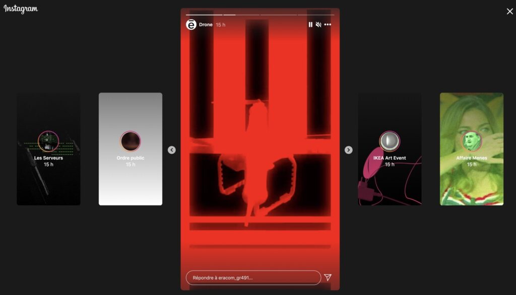
A brief proposed by Frederik Mahler-Andersen : students have to create an Instagram Story, as a series of short animations (combining video, image, text). The topic has to be a news article chosen by the student.
Create a new emoji character. Go through a brainstorming process to come up with useful new emoji types. Design them, in the style of different emoji / OS alphabets (Google, Twitter, OpenMoji…).
An assignment by David Reinfurt, from his Advanced Graphic Design at Princeton University. Reinfurt describes this assignment in the liner notes for an exhibition of student work, held at Hurley Gallery, Lewis Arts complex, in 2017:
The assignment is simple and lasts the full semester — design a new face for the apple watch which tells the time, and (by design) also changes the way you *read* the time. Simple, no? The students begin by considering, with a broad historical scope, how the representation of time affects the ways we understand it and use it.
For the past five years, I’ve taught a workshop for the graduate graphic design students at the Yale School of Art. The specific dates always change, but the basic assignment goes something like this:
Beginning Thursday, October 21, 2010, do a design operation that you are capable of repeating every day. Do it every day between today and up to and including Friday, January 28, 2011, the last day of the project, by which time you will have done the operation one hundred times. That afternoon, each student will have up to 15 minutes to present his or her one-hundred part project to the class.
The only restrictions on the operation you choose is that it must be repeated in some form every day, and that every iteration must be documented for eventual presentation. The medium is open, as is the final form of the presentation on the 100th day.
In the article, Bierut shares some of the most amazing outcomes. Some samples:
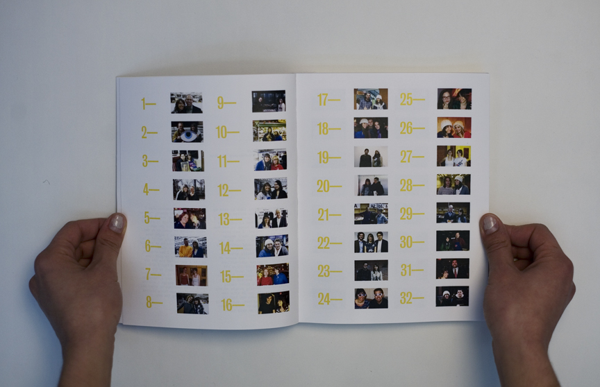
Lauren Adolfsen took a picture each day with a person she had never met. The product was a bound book, complete with thumbnail sketches of her portrait partners. I was number one. Amazingly, she ended up doing this for an entire year.
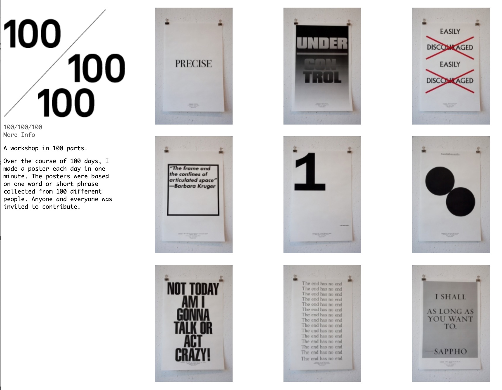
Zak Klauck: “Over the course of 100 days, I made a poster each day in one minute. The posters were based on one word or short phrase collected from 100 different people. Anyone and everyone was invited to contribute.” The perfect exercise for a graphic designer.
& Lauren, by Lauren AdolfsenOne minute posters, by Zak Klauck